
Table of Contents
ToggleDark cabinets anchor a kitchen with undeniable presence, but pairing them with the wrong colors turns bold into oppressive. Get it right, and the whole space opens up, warmth, depth, and just enough contrast to make the design work. This isn’t about trends or mood boards. It’s about understanding how light, surface materials, and color relationships actually function in a room where cabinetry dominates the visual field. Whether the cabinets are stained walnut, painted charcoal, or espresso-finished maple, the surrounding palette dictates whether they feel intentional or simply heavy.
Key Takeaways
- Color schemes for kitchens with dark cabinets succeed through contrast—light walls, bright ceilings, and reflective countertops prevent the space from feeling closed in or cave-like.
- Crisp white or light gray walls paired with dark cabinetry remain the most effective design approach, but warm whites with cream or gray undertones avoid the clinical sterile effect.
- Warm neutral and earthy tones like beige, taupe, sage green, and muted terracotta add personality and softness without competing visually with dark cabinet finishes.
- Strategic lighting with warm white (2700-3000K) LED under-cabinet strips and pendant fixtures is non-negotiable for making dark cabinets feel dramatic rather than dingy.
- Light-colored countertops in white quartz, light quartzite, or pale granite provide essential visual balance and reflect light, while textured backsplashes and flooring add dimensional contrast without color complexity.
Why Dark Cabinets Make a Bold Design Statement
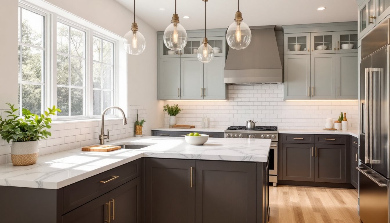
Dark cabinets create visual weight. That’s not a flaw, it’s the entire point. Where lighter cabinetry recedes, dark finishes claim territory and establish hierarchy in the room. They frame appliances, define work zones, and provide a grounding element that lighter surfaces can play against.
The key is contrast ratio. A kitchen with dark lower cabinets and lighter upper cabinets, walls, and countertops maintains balance. One with dark cabinets, dark counters, and dim lighting just feels closed in. The human eye needs variation to register depth and dimension.
Dark finishes also hide wear differently than light ones. Fingerprints and water spots show up more readily on dark painted surfaces, but scratches and dings are less visible on dark stained wood compared to white or cream paint. Maintenance requirements shift depending on the finish type, lacquered surfaces need different care than oil-rubbed or matte finishes.
From a design perspective, dark cabinets pair well with both traditional and modern aesthetics. Espresso-stained oak fits comfortably in a Craftsman-style kitchen, while flat-panel charcoal cabinets work in contemporary spaces. The surrounding color scheme determines which direction the design leans.
Best Color Schemes for Dark Cabinet Kitchens
Crisp White and Light Gray Pairings
White walls remain the most effective counterbalance to dark cabinetry. Not builder-grade flat white, that reads sterile against rich wood tones, but warm whites with slight cream or gray undertones. Benjamin Moore White Dove or Sherwin-Williams Alabaster both have enough warmth to prevent the stark contrast that makes a kitchen feel like a checkerboard.
Light gray works similarly but adds sophistication without the clinical feel. Agreeable Gray or Repose Gray from Sherwin-Williams provide neutral backdrops that don’t compete with the cabinets. These grays have warm undertones (beige and slight violet, respectively) that prevent the cold, industrial look some cooler grays create.
For ceilings, stick with pure white regardless of wall color. Keeping the ceiling bright reflects light downward and maintains the perception of height. Even in kitchens with 9- or 10-foot ceilings, a darker ceiling color compresses the space visually.
Trim and molding in bright white (like Pure White or Chantilly Lace) creates crisp transitions between dark cabinets and colored walls. This approach works especially well in homes with traditional design elements, where defined boundaries between surfaces are part of the architectural language.
Countertops in white or light gray continue the contrast theme. Quartz in Calacatta or Carrara patterns mimics marble veining without the maintenance headaches. Actual marble requires sealing and careful maintenance around acidic foods, which most homeowners underestimate until the first lemon juice etching appears.
Warm Neutrals and Earthy Tones
Warm neutrals soften the high contrast of dark cabinets against white. Beige, taupe, and greige (gray-beige hybrids) add warmth without visual clutter. These tones work particularly well in kitchens with natural light from south- or west-facing windows, where the sunlight brings out the warm undertones throughout the day.
Sherwin-Williams Accessible Beige or Balboa Mist both lean warm without going peachy or yellow. They’re flexible enough to pair with both cool-toned dark cabinets (charcoal, black-brown) and warm-toned cabinets (walnut, cherry).
Earthy tones introduce organic contrast. Sage green, terracotta, or muted gold walls bring warmth and personality. These colors demand confidence, they’re not neutral fallbacks. But in the right kitchen, particularly those incorporating natural materials and earthy elements, they create cohesion between cabinetry and the overall design narrative.
Terracotta or rust-colored accent walls work behind open shelving or in breakfast nooks adjacent to the main kitchen. They pair especially well with medium-brown cabinet stains like walnut or oak. Designers at Remodelista frequently showcase this combination in Mediterranean and Spanish-influenced kitchens.
Muted olive or sage green appears regularly in kitchens aiming for a modern farmhouse or transitional look. These greens balance dark cabinets without the stark contrast of white, and they pair naturally with brass or unlacquered bronze hardware. The key is keeping the saturation low, think dusty, not vibrant.
Wood-toned elements reinforce the warm neutral palette. Open shelving in natural oak or maple, a butcher-block island top, or floating shelves in reclaimed wood add textural warmth. These materials read as neutral but aren’t flat, grain patterns and natural color variation provide visual interest without pattern or color competition.
How to Balance Dark Cabinets with Lighting and Texture
Lighting determines whether dark cabinets feel dramatic or dingy. Task lighting becomes non-negotiable. Under-cabinet LED strips (hardwired, not battery-operated stick-on units) illuminate countertops and reduce the shadowing effect that dark upper cabinets create.
Install LED strips in warm white (2700-3000K) rather than cool white. Cool white (4000K+) makes dark wood look muddy and emphasizes the contrast harshly. Warm white brings out the richness in walnut, cherry, or espresso finishes and creates a more inviting workspace.
Pendant lighting over islands should provide both ambient light and visual interest. Position pendants 30-36 inches above the countertop for task lighting without head-bumping. Glass or open-frame pendants let light spread: solid metal shades concentrate it downward. Choose based on whether the island is primarily prep space (needs focused light) or gathering space (benefits from dispersed light).
Recessed can lights remain the workhorse of kitchen ambient lighting. Space them roughly 4 feet apart in a grid pattern, avoiding placement directly over the fronts of wall cabinets where they’ll cast shadows on the countertop. Use trims with adjustable or directional bulbs to aim light where it’s needed.
Texture adds dimension that color alone can’t provide. Matte-finish walls beside high-gloss cabinets create subtle contrast through sheen variation. A textured tile backsplash, subway tile with visible grout lines, zellige, or handmade ceramic, catches light differently throughout the day as angles shift.
Natural materials introduce texture without pattern. Stone countertops with honed or leathered finishes diffuse light rather than creating hot spots like polished surfaces do. According to kitchen designers featured on The Kitchn, leathered granite or soapstone pairs particularly well with dark cabinetry because the matte finish doesn’t compete for visual attention.
Flooring contributes to balance. Light wood floors, white oak, maple, or light-stained hickory, brighten the base plane without demanding attention. If the subfloor and budget allow, engineered hardwood in wider planks (5-7 inches) feels more modern and shows fewer seams. Luxury vinyl plank (LVP) offers a budget-friendly alternative with improved water resistance, though it lacks the acoustic properties of real wood.
Choosing the Right Backsplash and Countertop Colors
The backsplash is the transition zone, it mediates between dark cabinets and lighter walls or between dark lowers and light uppers. White subway tile remains popular because it works, not because it’s exciting. The 3×6-inch format with white or light gray grout provides texture through the grid pattern without adding color complexity.
For more visual interest, patterned cement tile or mosaic in geometric designs adds a focal point. Keep the pattern’s background color light (white, cream, light gray) so it reads as an accent rather than a competing dark element. Limit bold backsplash patterns to the area between countertop and upper cabinets, extending them to the ceiling can overwhelm.
Large-format tile (12×24 inches or larger) minimizes grout lines and creates a cleaner, more contemporary look. Marble-look porcelain in white or light gray provides the aesthetic of natural stone without the maintenance. Actual marble backsplashes can handle normal cooking moisture but should be sealed annually if they’re behind the cooktop where grease splatters occur.
Glass tile reflects light effectively, which helps in kitchens with limited natural light. Opt for clear, white, or pale blue glass rather than darker colors that would compound the dark cabinet effect. The reflective quality bounces light from under-cabinet fixtures back into the room.
Countertops carry the most surface area after cabinets, so their color has significant impact. White or light gray quartz provides the highest contrast and the most light-reflective surface. Brands like Caesarstone, Silestone, and Cambria offer dozens of white and light gray options with varying vein patterns.
For homeowners wanting something beyond white, quartzite in lighter tones (Taj Mahal, Sea Pearl, or White Macaubas) offers the durability of granite with the look of marble. Quartzite is harder than granite and less porous than marble, it’s the Goldilocks option for busy kitchens.
Butcher block countertops add warmth and texture but require maintenance. Monthly oiling with food-grade mineral oil or butcher block oil prevents drying and cracking. They scratch and dent (which some homeowners consider patina, others consider damage), and they’re not suitable next to sinks or cooktops without extra sealing or protective trivets.
If the budget allows for natural stone, light granite (Colonial White, Kashmir White, or Bianco Romano) provides durability and classic appeal. Granite requires sealing every 1-2 years depending on porosity. Test by putting a few drops of water on the surface, if it darkens within 4-5 minutes, it needs sealing.
For unique spaces that benefit from creative surface treatments and artistic details, consider terrazzo or recycled glass countertops. Both come in light base colors with colorful aggregate that adds visual interest without darkening the overall palette. They’re durable, low-maintenance, and less common than granite or quartz.
Conclusion
Dark cabinets don’t require apologies or compromises, they need supporting players that understand the assignment. Light walls, strategic lighting, and countertops that contrast rather than compete turn potential heaviness into intentional design weight. The difference between a kitchen that feels cave-like and one that feels grounded comes down to the ratios: how much light balances the dark, where texture breaks up flat color, and whether the materials in the room have anything to say to each other. Choose palettes based on how light actually moves through the space, and the cabinets will anchor rather than overwhelm.